
Scope & logotype
Plunging into a New Visual Era for the 15th Anniversary
The new logo features a bold interpretation of the letter “O” in AQUOISE, transformed into a pictogram that evokes the ripples of water. This subtle yet powerful change reinforces the link between the center’s name and its central element, water, enriching the sensory connection with the public.

Concept
Experience the wave of freshness at AQUOISE.
The chosen color palette, combining the blue of the water and the yellow of the sun, creates an energetic and welcoming visual contrast. The new typography, “Autor”, adds a touch of modernity and freshness, inviting visitors to a moment of relaxation under the sign of dynamism and clarity.
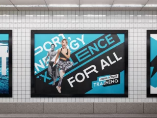
To mark this new chapter, a series of branded goodies was distributed, accompanied by an outdoor poster campaign and targeted actions on social networks. These initiatives not only celebrated the center’s anniversary, but also solidified its new image in the minds of visitors and the community.
Today, AQUOISE presents itself not only as a place for aquatic leisure activities, but also as a space where every visit becomes a unique and memorable experience, reflected in a lively and inspiring visual identity.