Project
From idea to impact, a 20-year adventure.
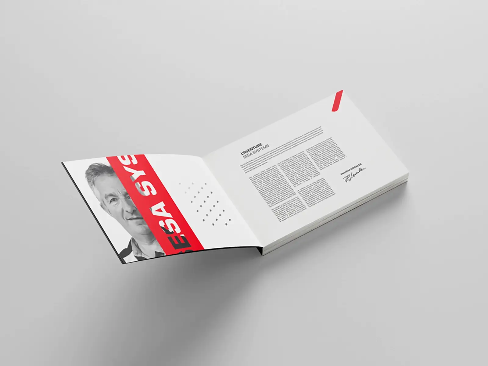
The project began with the implementation of a rigorous editorial railroad, enabling content to be organized in a coherent and engaging way. For this special occasion, it was essential to renew and refresh SESA SYSTEMS’ visual identity, while remaining true to its values and aesthetics.
Logotype
A legacy of innovation unveiled.
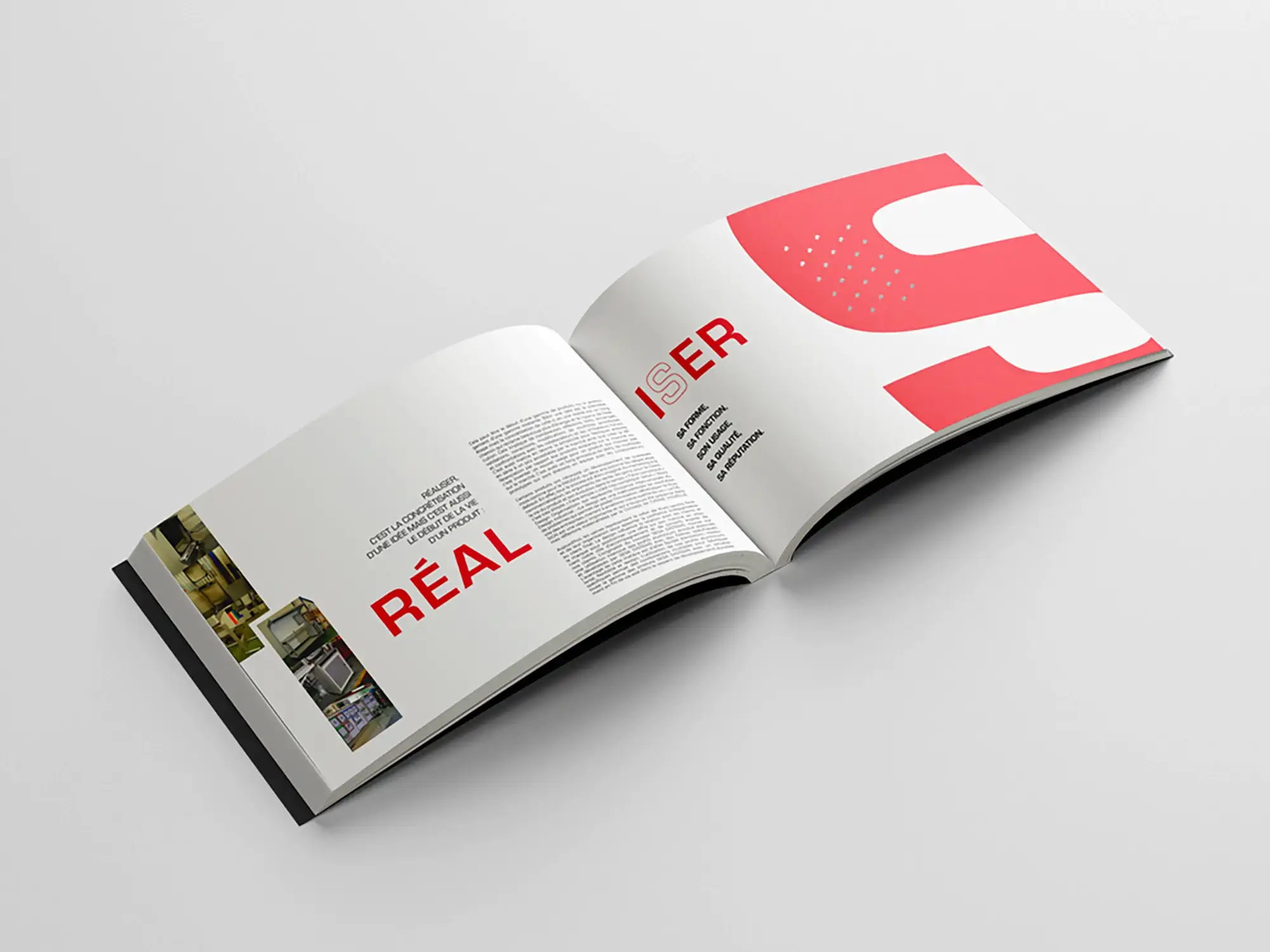
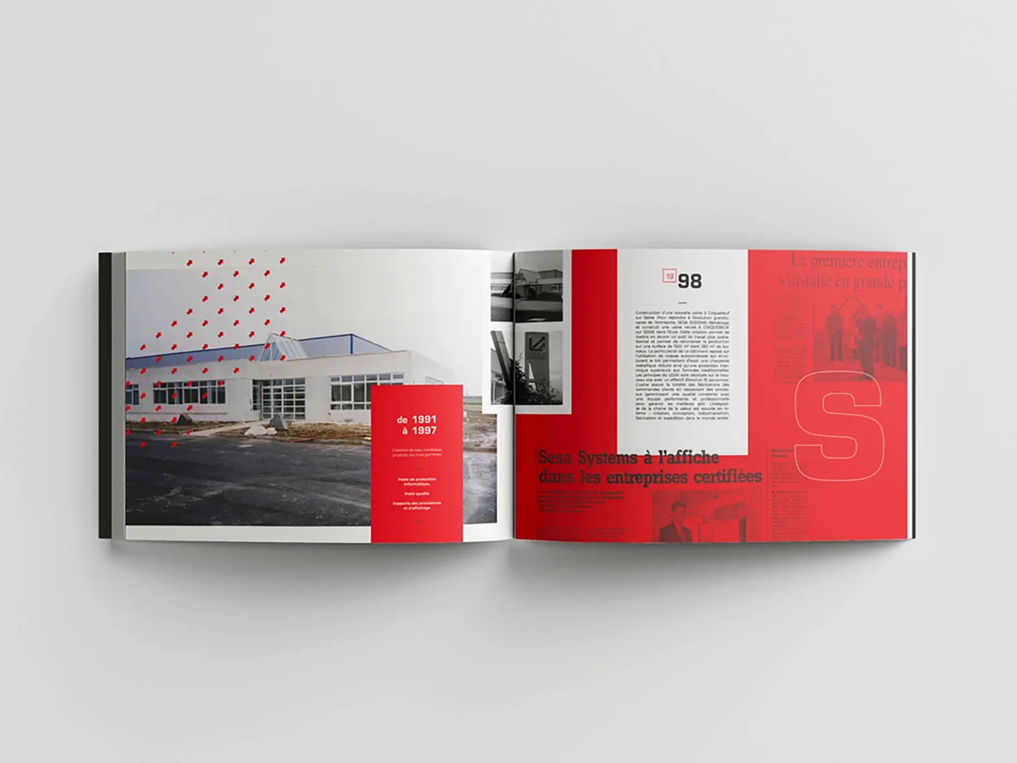
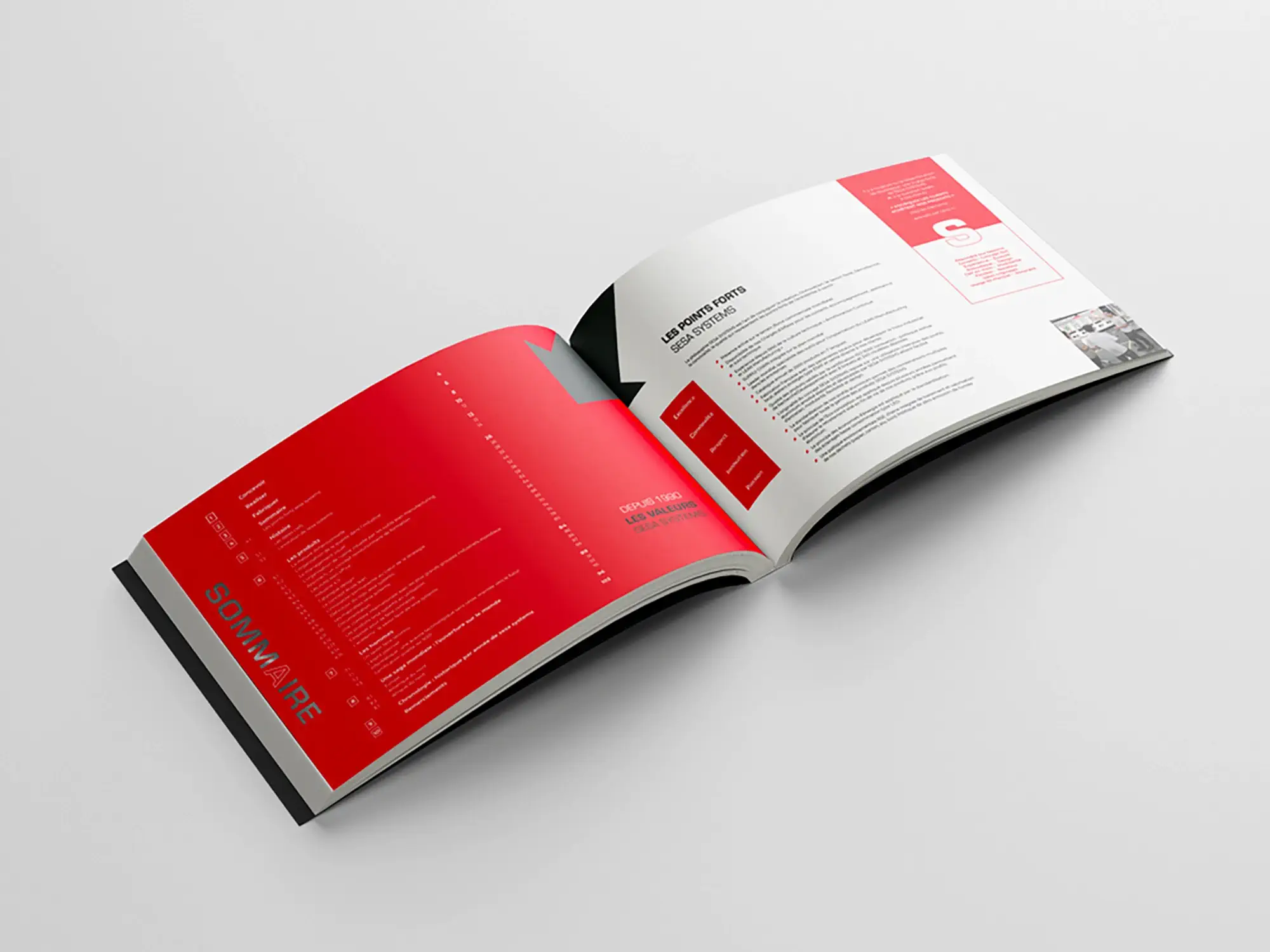
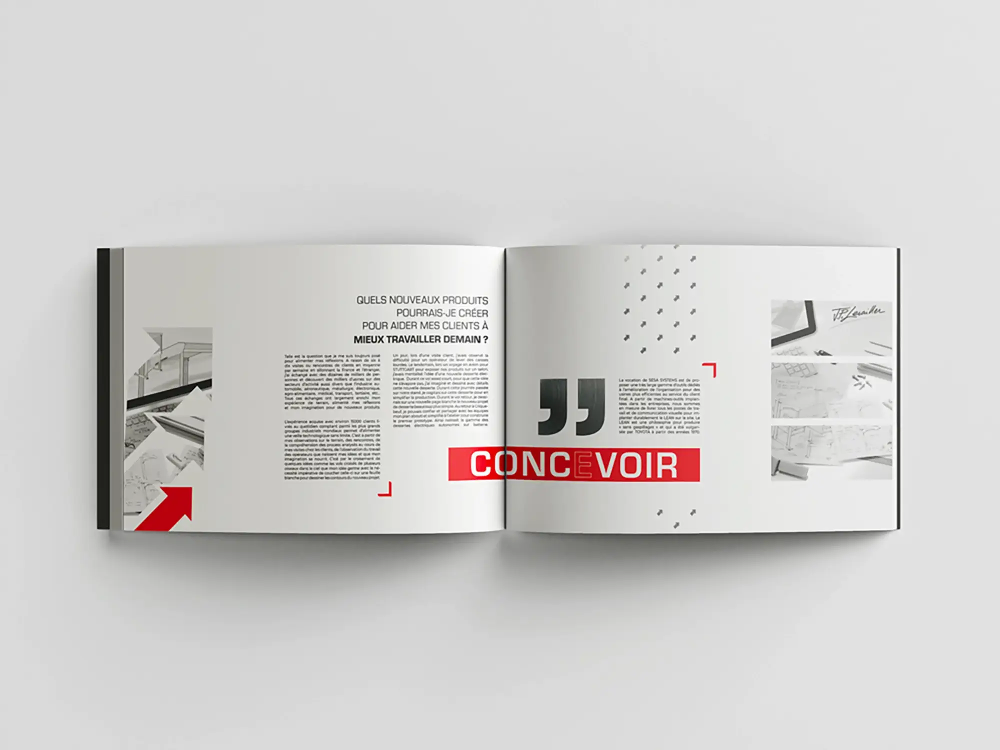
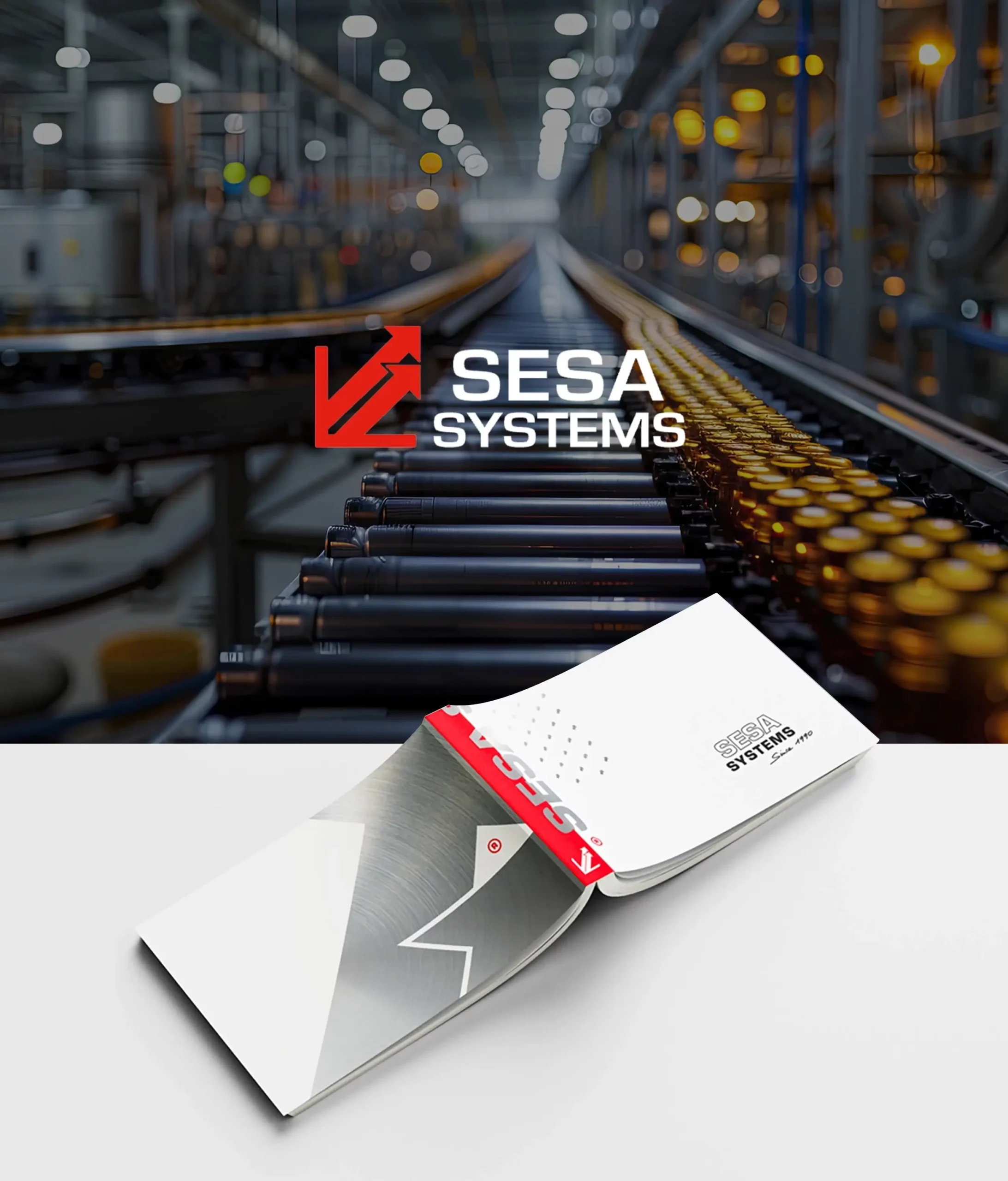
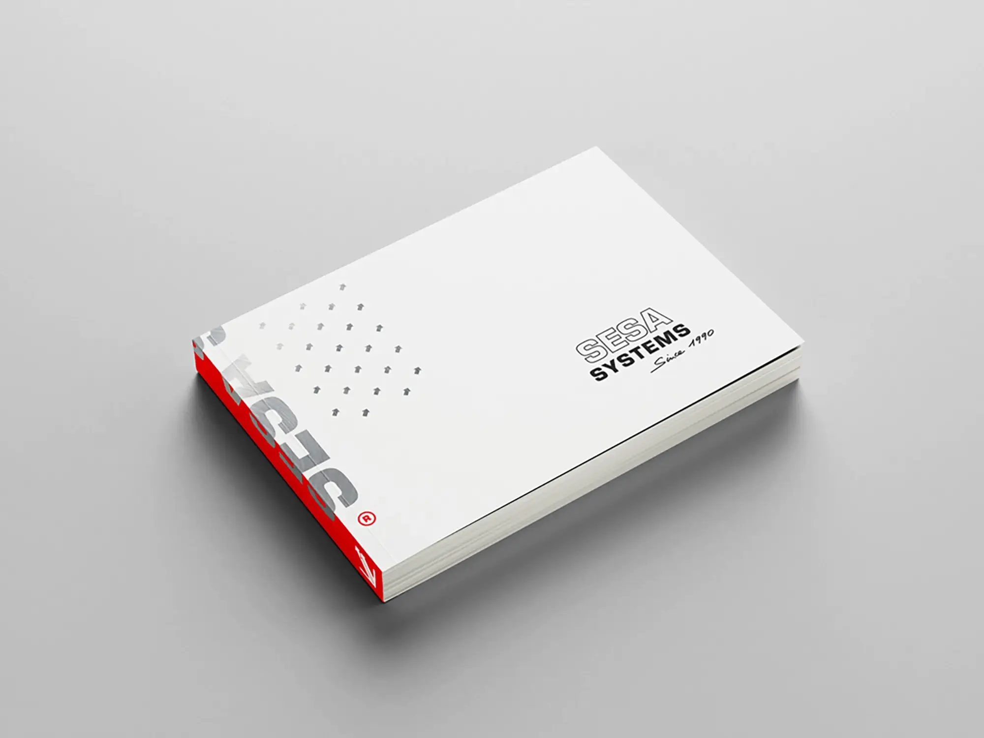
The book’s graphic design was influenced by the distinctive elements of the SESA SYSTEMS logo, in particular the solids and arrows, which symbolize dynamism and future orientation. Using a modern layout, we emphasized key terms and the group’s core values, making the book not only informative but also visually captivating.
Templates varied to adapt each section to its specific content, offering a fluid and enjoyable reading experience. The result is a book that is not just a communication tool but an objet d’art, inspiring and educating its readers on the importance of innovation and efficiency in modern industry.
SESA SYSTEMS’ retrospective book is therefore a complete, playful and aesthetic work, perfectly reflecting the trajectory and ambitions of a company looking to the future of industry.
